Writing
Ivory, a pair of near-monochromatic emacs themes
Introducing Ivory, a pair of near-monochromatic emacs themes.
I’ve been building a pair of emacs themes on and off for a while, and they’ve reached the point where I use them every day. The package is called Ivory, and it ships as ivory-light and ivory-dark. The themes are near-monochromatic, meaning almost every color in them is a shade of gray. I tried a few other monochrome themes, kept catching on small things I didn’t like, and eventually decided to roll my own.
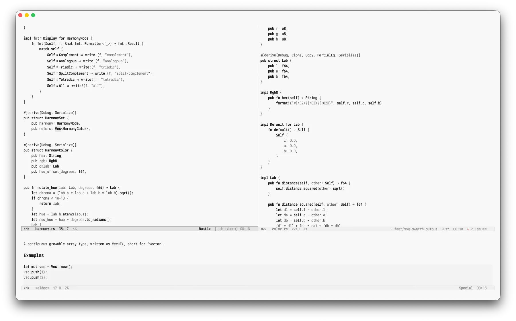
The case against syntax color
Open a popular theme and look at the source code. Keywords get one color, strings another, types a third, constants a fourth, comments a fifth, and a builtin or two picks up its own accent somewhere in there. The idea is that color helps you parse code at a glance.
I don’t think color does much for me. When I read code, I’m not hunting for purple tokens. I’m following structure: this is a function, here is its body, this is what it returns, and that comment is something I can skip. The color rides along on top of structure I already get from indentation and the shape of the tokens. Most of the time it’s decoration that happens to line up with meaning.
And decoration costs something. Six saturated hues fighting for attention in one buffer is just noise. Past a certain density, a heavily highlighted file stops looking like information and starts looking like unicorn vomit, color sprayed everywhere with no hierarchy to it. It’s the kind of loud you stop noticing, the way you stop hearing a fan, except your eyes are still sorting it whether you asked them to or not. And once one accent starts to bug you, you start seeing all of them.
I care more about contrast than color itself. The tokens that matter should stand out, so your eye knows where to land. Color is the usual way themes create that contrast, but lately I have found weight, intensity, and surfaces more useful. Those are what pull things apart in Ivory.
What carries the distinction instead
Three things, mostly.
Foreground intensity. A gray buffer that runs from near-background to full strength. Primary code text sits near the top; comments and other quiet text sit lower. That’s a hierarchy for free, and it tracks importance instead of some arbitrary token category.
Weight. Bold does most of the work worth doing. Type names, function names, and constants stay bold, because in a gray buffer those are the anchors your eye actually wants. Keywords and builtins carry weight too. Variables and properties stay normal weight, a notch quieter. It’s on by default; flip ivory-themes-bold-constructs if you don’t want it.
Surfaces. Backgrounds pull more weight than you’d expect. A code block, a highlighted region, the active mode line, and a search match each get a background shift instead of a foreground color. The text on top stays legible, and the area still reads as special.
The Ivory themes keep italics off by default. I find them more distracting than useful, but there’s an option if you disagree.
The grayscale ladder
Hex is an awkward way to describe grays. #999999, #8a8a8a, and #595959 are all just “some gray,” and you can’t tell which is lighter without decoding the channels.
Gray has one property the rest of the color space doesn’t. The three channels are equal, so a single number pins it down completely. #8a8a8a is 138, 138, 138. In Ivory’s palette source that color is written (gray 138). (gray 0) is black, (gray 255) is white, and the middle of the buffer lands around (gray 138).
That turns the palette into one ladder. I can soften comments by raising the number a few rungs, or push dark-mode dim text further back by lowering it. The relationships become arithmetic you can read instead of hex you have to compare, and it made tuning the themes far less fiddly. I was reasoning about steps on a ladder, not guessing at hex values.
Every role maintains at least a 3:1 contrast ratio against its background. Primary text sits well clear of it. The floor is really there for the quiet stuff, comments and dim labels and completion annotations, so they stay legible without shouting.
Light mode hugs pure white with faint gray surfaces. Dark mode needed a wider spread to keep from going flat, so its ladder runs from a bright foreground all the way down to some very dark surfaces.
Pure black and pure white backgrounds can look harsh on some screens. The ivory-themes-soft-backgrounds option moves each background just off the end of the ladder. Instead of true black and true white, it uses #f8f8f8 for light and #080808 for dark, then adjusts the neighboring surfaces to match. You can toggle it without a restart.
Where color is allowed back in
The Ivory themes are near-monochromatic, with color reserved for diffs, diagnostics, and version control.
Diffs keep red and green. Red still means removed and green means added, so the Ivory themes leave that convention alone.
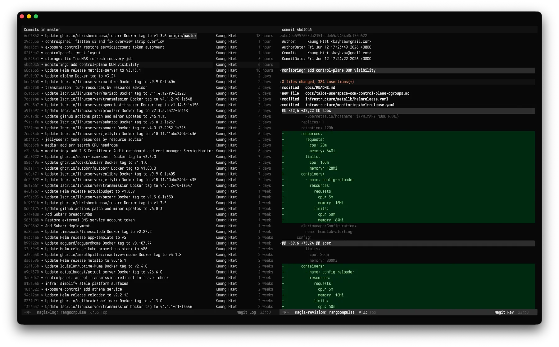
Diagnostics keep red, yellow, and green for error, warning, and note. The underlines are straight, though, since I prefer straight lines to squiggles.
Everything else that’s normally colorful goes gray. Magit’s log and Transient’s popup menus both ship full of color by default, and the Ivory themes tone them down to match the rest of the color scheme.
Trying it
The package is on GitHub. With straight.el and use-package, the setup looks like this.
(use-package ivory-themes
  :straight (:type git
             :host github
             :repo "khzaw/ivory-themes")
  :custom
  (ivory-themes-bold-constructs t)
  (ivory-themes-italic-constructs nil)
  :config
  (load-theme 'ivory-dark t))
The README has more install recipes, plus the options and palette override system if you want more contrast, warmer comments, or stronger diffs.
If your editor has ever felt a little too busy and you’ve quietly suspected the color wasn’t helping you read, try the Ivory themes and see if the quieter approach fits.